Hackitmac Re-branding

Originally posted on Medium by M. O. Fouda
Branding is one of the most essential things to any organization. It’s your image. How do you want the stakeholders you deal with to view you? How do you want people who don’t know you to have as a first impression?
This is how Hackitmac used to look:
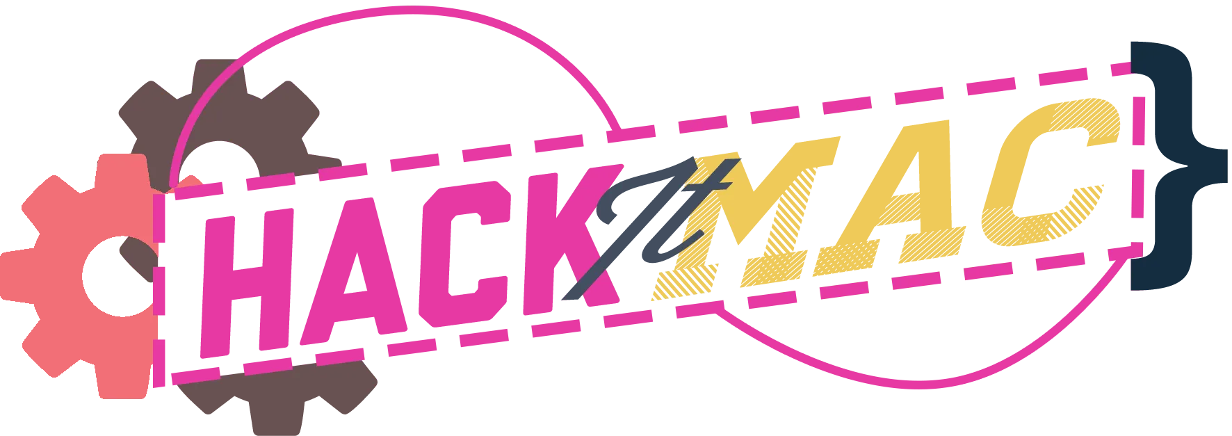
And so a couple of notes here; for just a logo for our first year, this was more than fine. However, it wasn’t enough for our plans and dreams of where we wanted to take the club. We needed a cleaner logo that’s easier to read. We needed a full identity that screams our dreams and values and what we do as a club. We needed a full brand. So we created one.
This is how Hackitmac looks now:
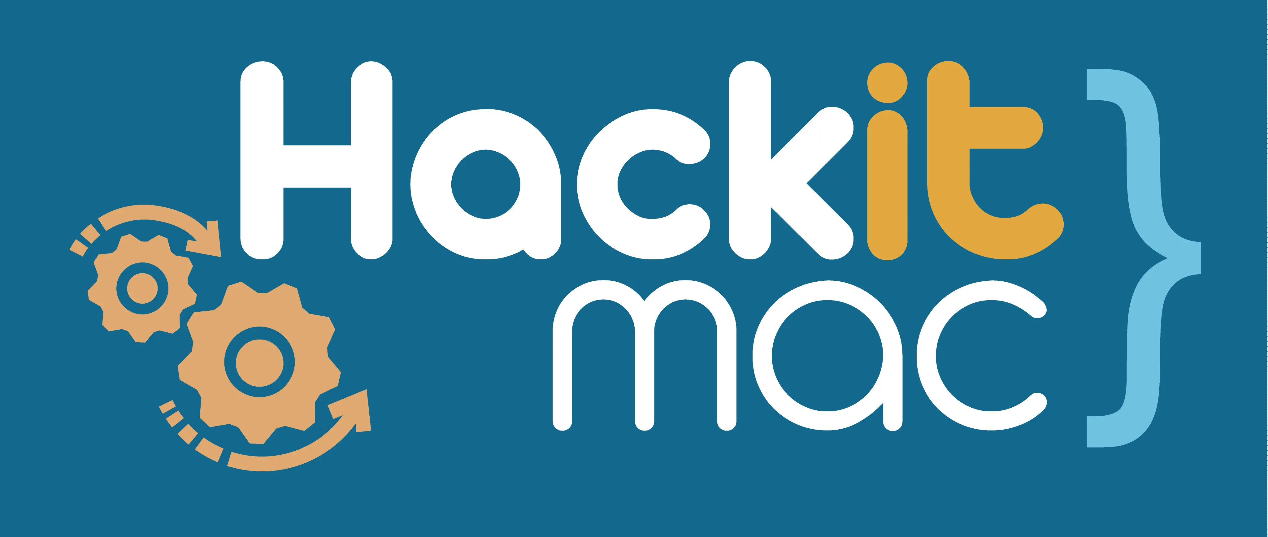
It’s a lot cleaner, and a lot higher resolution. But that’s not the point!
The new branding represents us in a way that allows people’s first impression to have a visual of what we do as a community and as a club.
Here’s how:
- The logo is a lot cleaner, and easier to read. We emphasized a lot on the “Hack” by separating the words by colour to allow for an easier faster read.
-
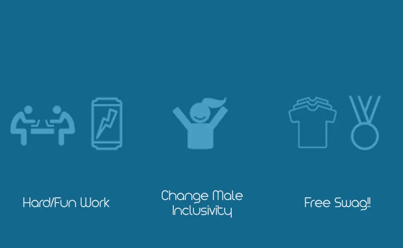
We made sure to visualize what “hacking” & “hackathons” are all about by adding a pattern of moments and things that everyone who has ever been to a hackathon would relate to. A lot of people associate “hacking” with the illegal activities of stealing and cracking into people’s computers. But that’s not what we do!
-
We are a community interested in learning, building, and experiencing with different cool technologies in order to solve real problems. We are diverse. We are positive. We love free swag. All those are things you will find in our pattern.
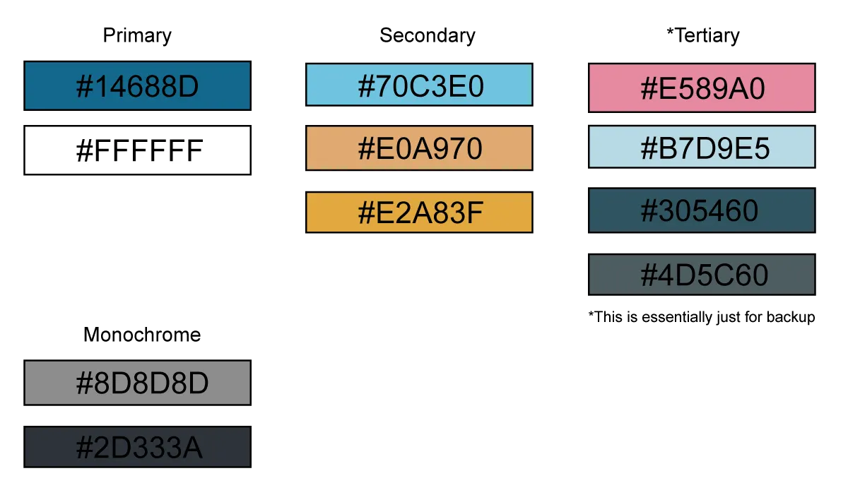
- Our main colours are different levels of Blue and different levels of orange/gold. Why? Typically colours are associated with meaning psychologically (seriously! This is so cool Google it up). Here’s how it goes;
- Blue is associated with confidence, comfortable, and quiet; where
- Orange is typically associated with creativity, innovation, and positive encouraging energy.
This sums up our club and community precisely. We take risks by adding to our workloads and spending time travelling and building things; yet we are very confident in what we’re doing. We love diversity and working with others (in fact, a huge number of the club are not engineers and never coded before!) yet we’re very comfortable going outside of our comfort zones to be truly innovative. Lastly, we’re a very welcoming community that is self-motivated and encouraging towards each other, and is never too noisy for a voice to be heard :)
…
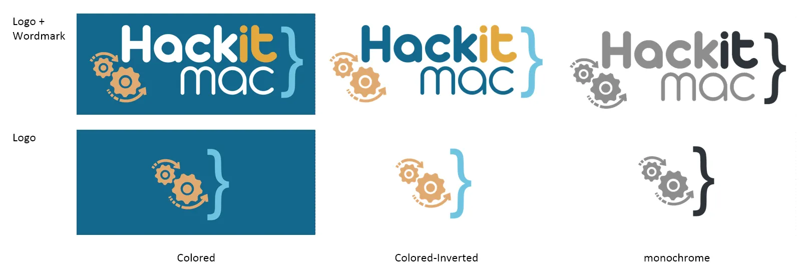
Alas, if you’re looking for branding material, here’s how the new logo looks across the different colours:
& here’s the colour palette we are using:
…
So what do you think? Do you have any feedback to us? Please let us know through any of our contacting channels, as we dearly dearly value that :)