Traffic Light Buttons
Originally posted on Medium by M. O. Fouda
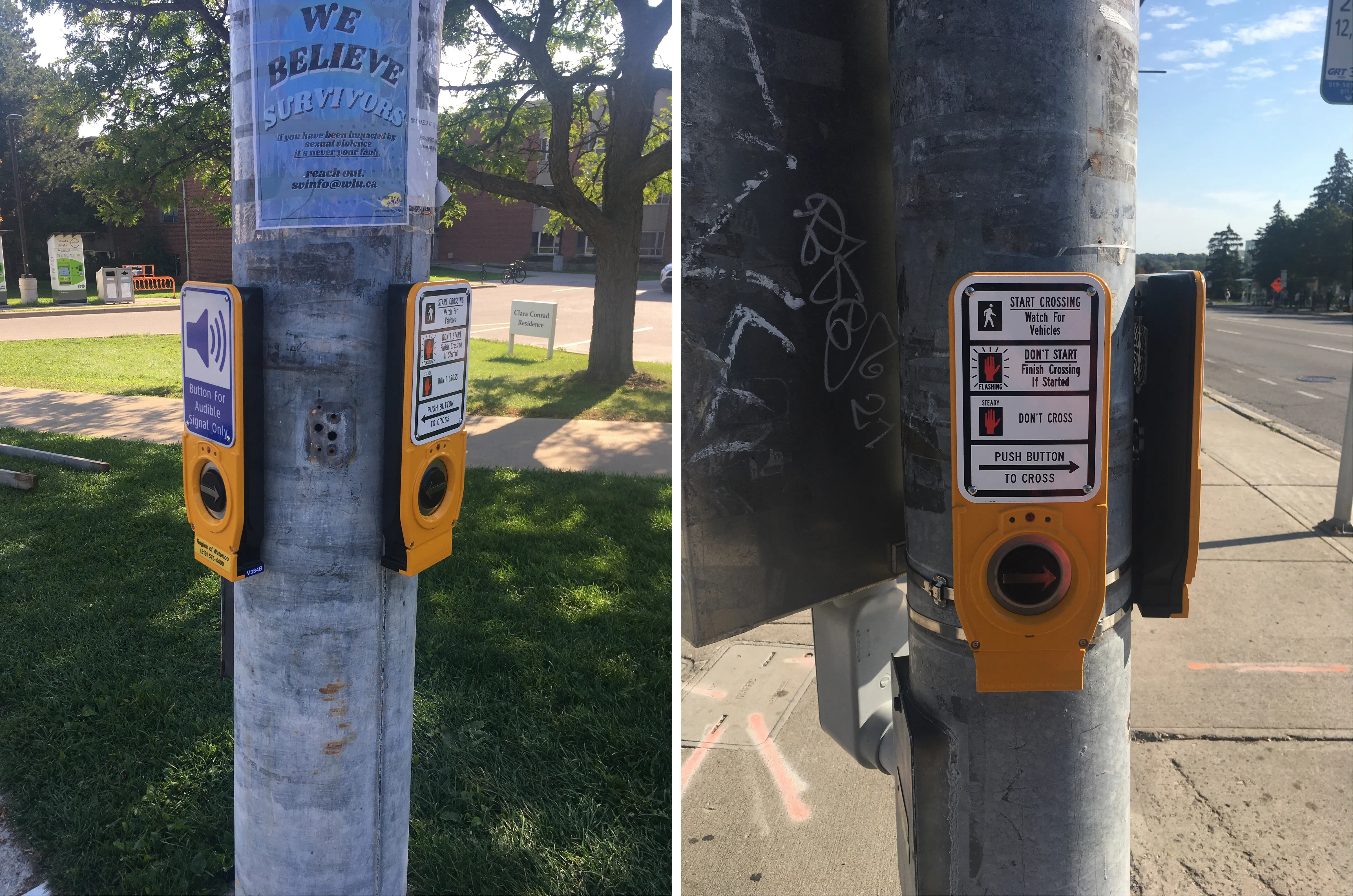
The other day I was crossing the street with a friend, when she pointed out that I didn’t have to press on the button to cross because it was only for audible signal.

It got me thinking for a moment, I never once realized that THAT IS what that sign meant. It seemed to me as an “additional” audible sound, provided for those who wanted or needed it. But why did I think that way, especially when it’s clearly written “Button For Audible Signal Only”? It didn’t take long to observe how other pedestrians also always pressed the button, missing the audible icon. On the other hand, some pedestrians didn’t press the normal non-audible button on the other side at all, assuming they didn’t need to press the button similar to the audible button, when in fact it was not. Again, it clearly had the information written on it, yet people used it weirdly. I knew I wasn’t alone here, and it got me thinking about how poorly designed these buttons are. I understand that this is a first world problem, nevertheless I thought it was interesting design problem.
Why does this mismatch between intended use and actual use exist?
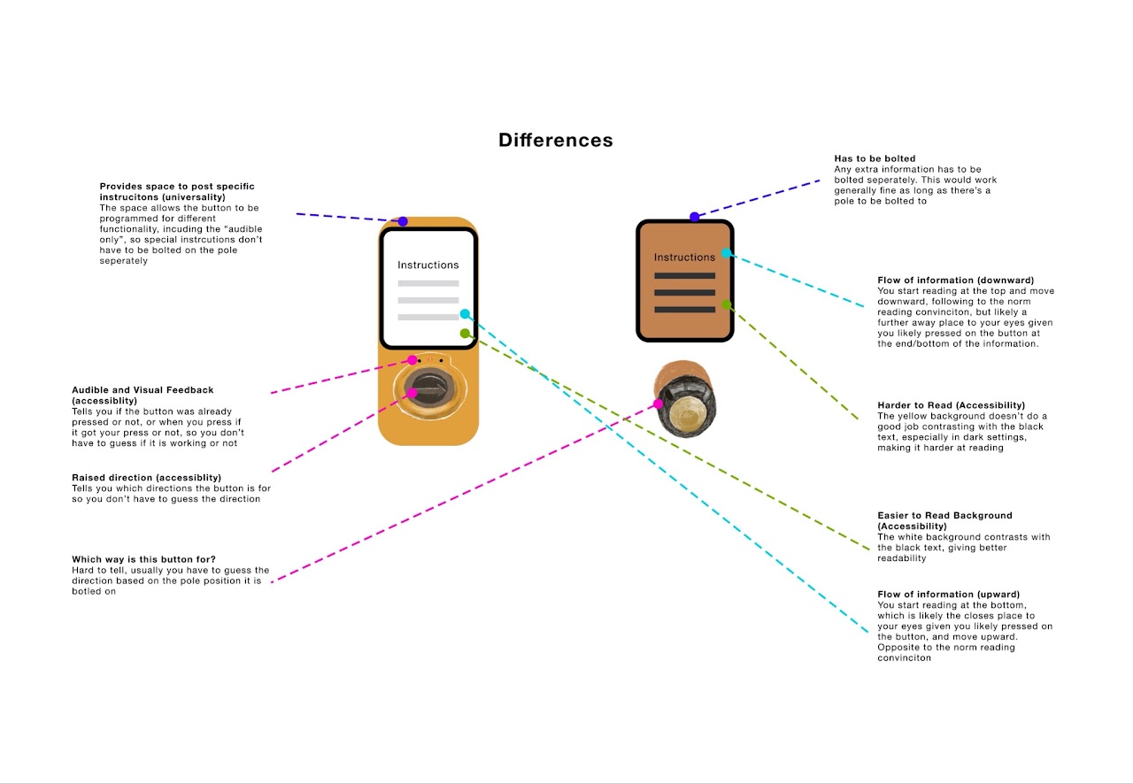
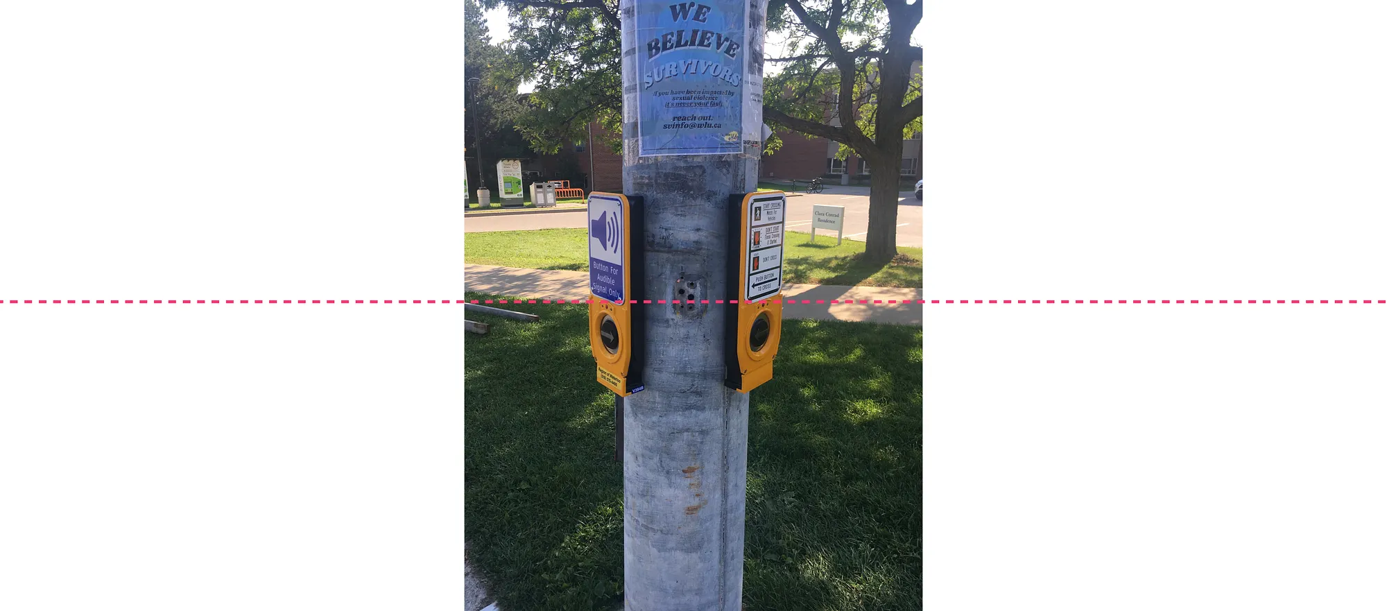
Firstly, the smaller picture
Same styling, different functionality
-
What do both buttons communicate? They both communicate that they can afford to be pressed, given the raised arrow and a light indicated if it is pressed or not. They communicate the direction to cross, given the raised arrow. They are both distinct enough to notice from the pole given the colour (yellow) that grabs your attention. I think it also communicates that it can provide an audible signal (on top of its main function, which is pressing to cross), that is assuming you don’t read the text.
-
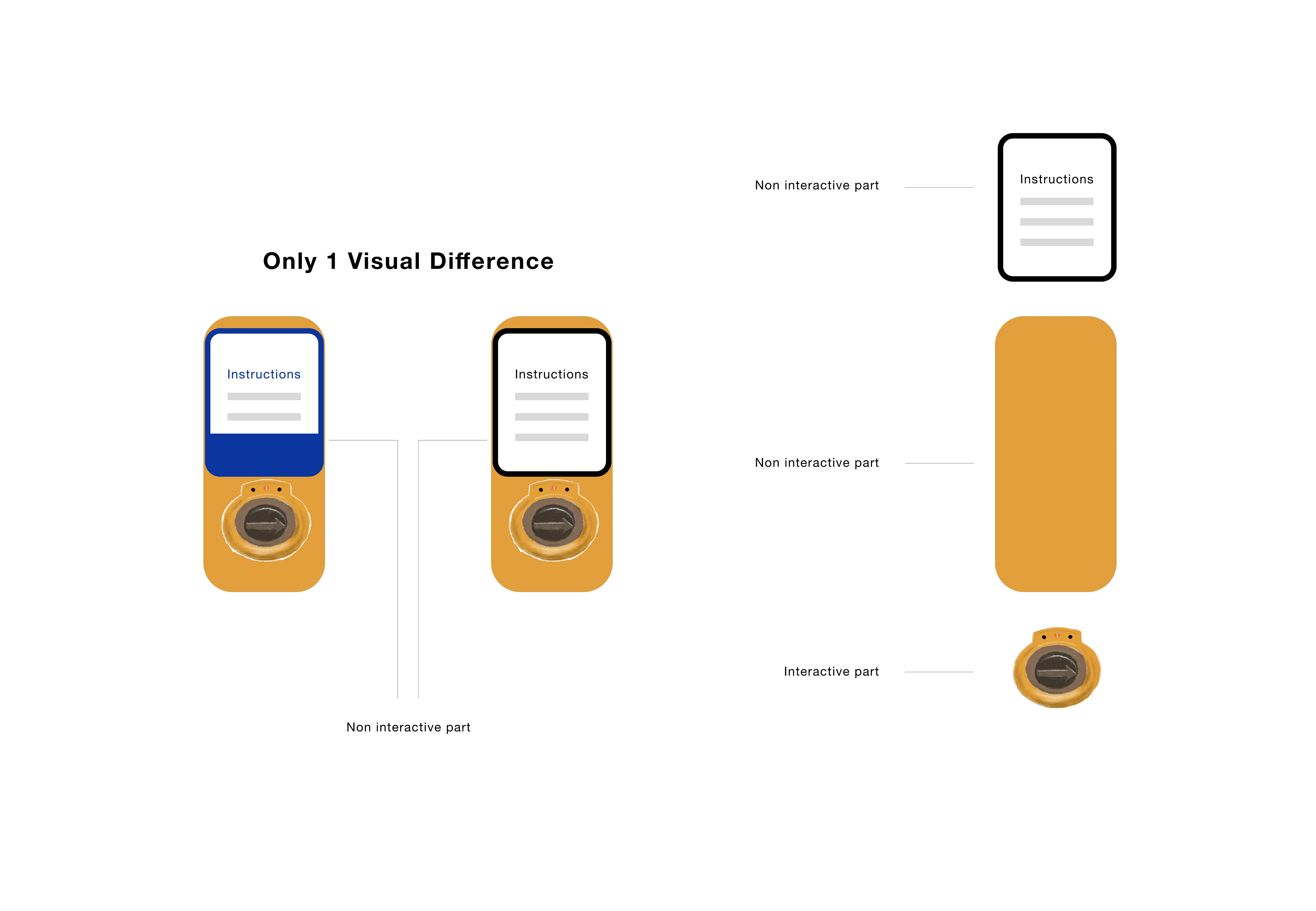
I believe the problem is that this button has two components: a non-interactive part and an interactive part. The problem is that only the non-interactive (the sign) part is visually different. The interactive part (the button, where it is safe to assume most people’s eyes will follow their hands and be looking at) is visually the same.

So how do we fix this?
- Well, we can make the interactive part of the button to be visually different. For example, we can paint the whole button to be blue to set it apart from the buttons that need to be pressed by everyone. This way, we can set different standards or default for the buttons. The default button that need to be pressed can be normal yellow, unless it is an audible only one (then it is blue). Moreover, we can paint the arrow button black (normally silver, so it can be seen), and paint the button that has to be pressed by everyone a more distinctive colour (yellow). This is to “hide” it so that if you don’t need the audible button, your eyes don’t instinctively see it, and if you need the audible you can still find it.

-
On the other hand, there are a lot of text needed to explain how to cross the street. There are a lot of accessibility standards (like WCAGG) we can tap into to improve this, but one simple way I think would be perfect is to limit the text to something your friend would tell you when you’re both crossing (for example, “you don’t need to press” or “you need to press to cross”)
-
Why? Having a lot of text is similar to having slides lots of text that deviate from the presenter’s focus, and is considered a bad practice in presentations. Compare this to good slides with minimal text, that does a good job getting the point across. Don Norman is often quoted saying that good design doesn’t need to be explained, and makes sense.
-
Perhaps this text was aimed at pedestrians jay-walking, or crossing the street without paying attention, or not patient enough to wait for the light. In this case, it is a poor assumption to except someone who doesn’t wait for the light to suddenly not only start waiting for their turn BUT also read all this text.

Secondly, the bigger picture
Inconsistencies across styling and functionality
-
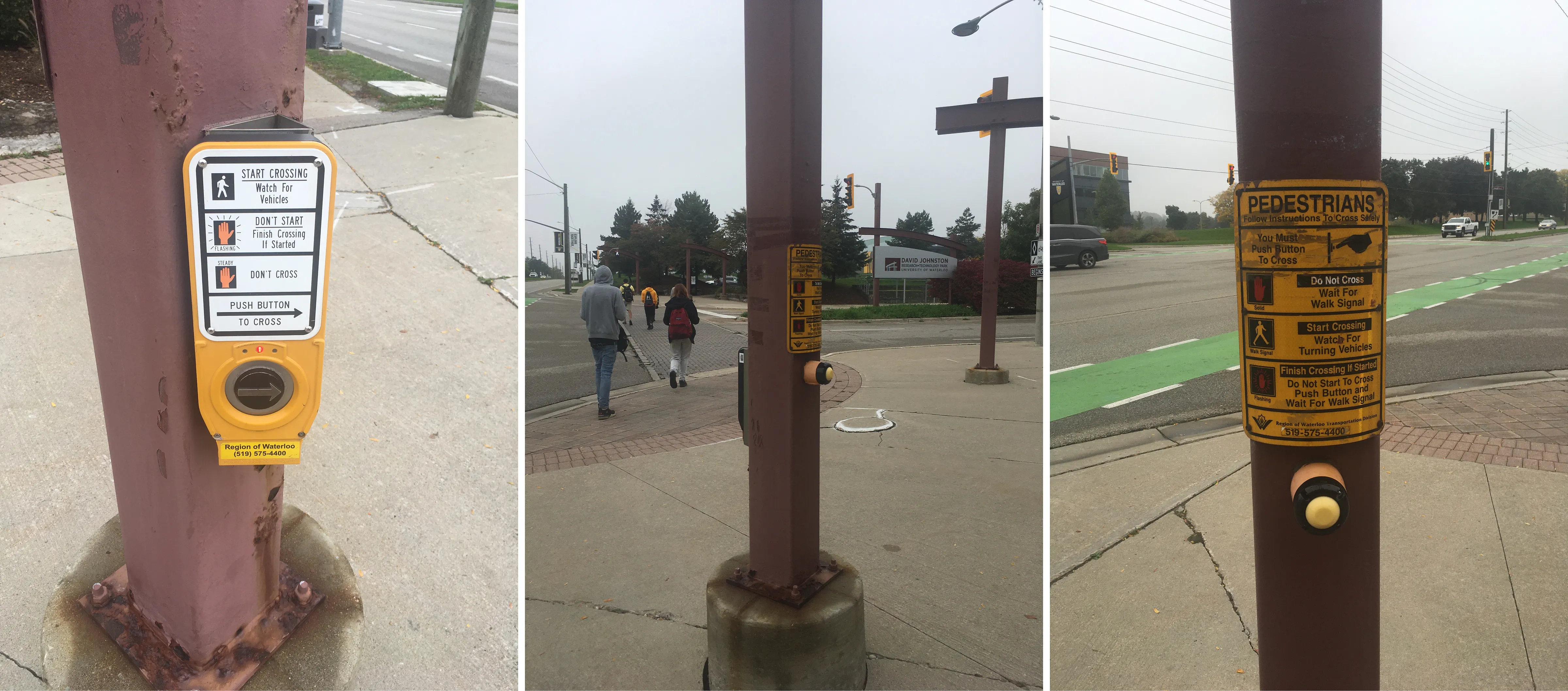
Now when we zoom out of this one intersection, and into the wild world of crossing buttons, we see a vast difference in functionalities and styles. Given there are different designs out there, there is a variation in what is expected from the pedestrian, and it not only do things vary from city to city but even from traffic light to traffic light within the same city.
-
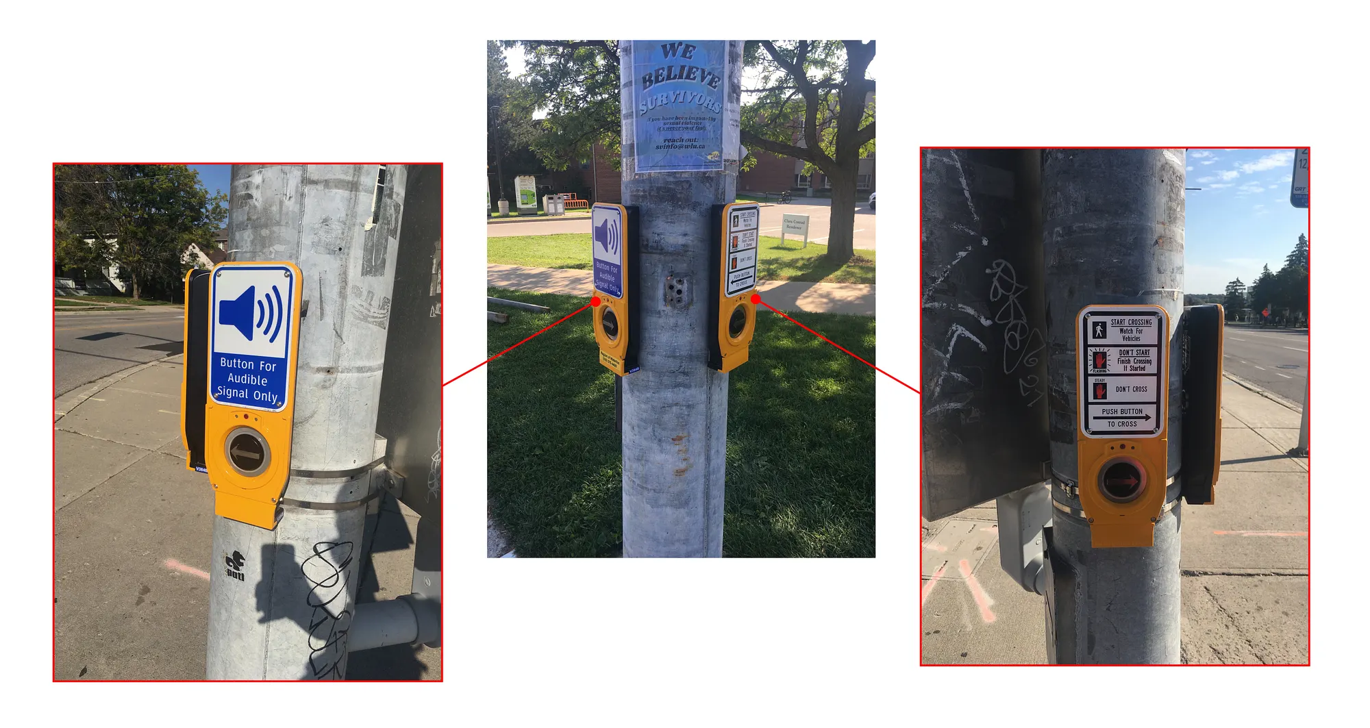
For example, this is an example of an intersection, with different styles for buttons. Yet, they provide the same exact functionality.


-
Of course it seems like one button (the left) is more modern and seems like an upgraded version of the other (right button). However, when you look past the shine of the newer button, you find that all the differences are accessibility features. In other words, both buttons provide almost the same functionality
-
Both require the user to press to cross, and both have tedious long instructions to read because they both seem to think that you need to be educated on how to cross the street!
The problem is, when you add all this together and consider the user’s perspective, this is how the big picture looks like (from a pedestrian’s perspective):
Buttons that look similar function differently, and buttons that look different function similarly!

So, how do we fix this?
I believe one of the reasons this could have happened is due to different iterations on the button designs, as well as possible different manufacturers or third-party designers. This is one way we could arrive at multiple styles and multiple functionalities of the same button. Thus, one way to solve this is by creating a standard for what each button is suppose to do. For example, based on the above buttons,
-
A button press to cross
-
A button press for audible only signal
-
A no-button

Then we can distinguish between all three functionality and translate them into a visual standard that would communicate their functionality at glance, such as follows:
-
A button press to cross — standard white and yellow
-
A button press for audible only signal — Blue and white
-
A no-button — Blue and white
Thus, we communicate to the users that when it’s the colour blue, you don’t need to interact, the light will give you a turn by itself. When it’s yellow and white, you need to interact in order to get a turn.
Additional notes: this of course does not take into account the full library of colours and their meaning that the city or traffic authorities already have. So the colours suggested here are only to make the point. Furthermore, even the choice of a colour such as yellow as the standard could be the wrong choice. For example, if pedestrians tend to cross intersections without waiting their turn, perhaps a stronger colour such as red (similar to the Stop sign) is more appropriate choice.

Why and how did having so much different designs at once happen?
-
The cost of manufacturing. Since it most likely would cost multiple times if each specific button function was designed differently, it makes more sense to design all in one shape and replicate it. For example, notice how most of the buttons can work almost universally in all traffic lights, regardless of direction and place. This is a good design. However, the problem here in my belief lies in the buttons being too universal and not distinguishable in terms of their different functionality. We can keep the same manufacturing efficiencies, while giving each button a distinguishable look through means such as paint.
-
Newer versions vs older versions. It is safe to assume some of the buttons are iterations and different versions through the years. Realistically, it would be hard to justify replacing a button if it is functional, just to update its looks. In fact, it would be unsustainable on many levels, such as financially and environmentally, to replace any buttons just to unify their looks. We can however “service” them, by altering their looks, in order to give them a new more-detailed visual to match their functionality.